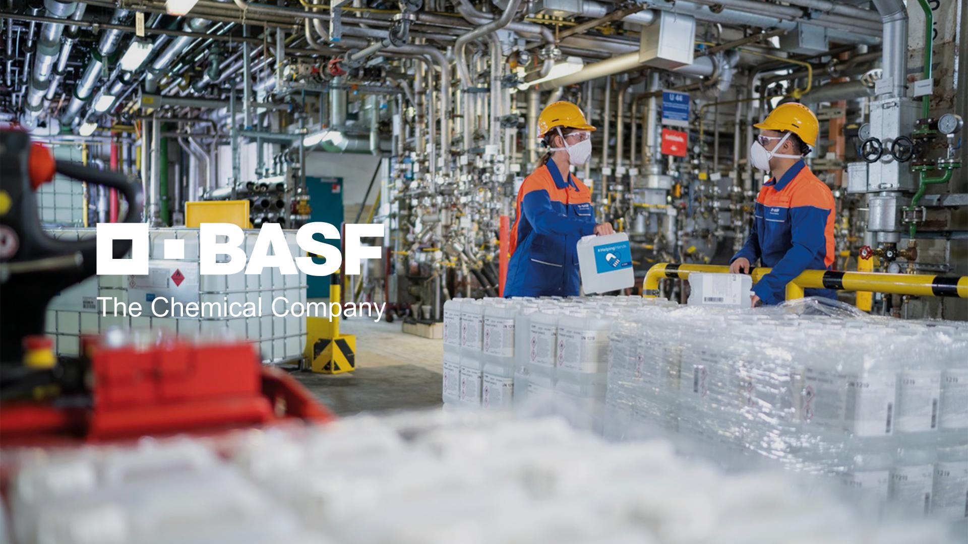

Embark on the journey of BASF branding in China with Labbrand, as they skillfully craft the verbal and visual identity system for the new paint brand. Witness the emergence of a colorful brand image, seamlessly embodying high-quality attributes. Experience the strategic brilliance in Labbrand’s approach, shaping a compelling brand presence for BASF in the dynamic Chinese marketplace.
BASF is the largest diversified chemical company in the world headquartered in Ludwigshafen, Germany. The BASF Group comprises subsidiaries and joint ventures in more than 80 countries and operates six integrated production sites and 390 other production sites in Europe, Asia, Australia, Americas and Africa. BASF has customers in over 200 countries and supplies products to a wide variety of industries.
BASF planned to launch a new Architectural Coating with technology such as Acrylic, Elastomeric, Silicon, and so on. The new paint brand was developed to produce environmentally friendly decorative construction paint for the Chinese market. The brand needed an attractive and memorable Chinese name, English name, slogan, as well as brand visual identity system that communicated the desired brand attributes.
After four rounds of brand name candidate generation from brainstorm, software generation, preliminary selection and smart legal check, we recommended 6 final Chinese name candidates. Based on the 6 Chinese names, six groups of corresponding English names were developed and selected. Three rounds of creation were conducted to generate the Chinese slogan. We then conducted both quantitative and qualitative research as well as linguistic checks to help finalize the new paint brand’s verbal identity.
The Chinese name 诺缤 [nuò bīn] and English name NORBIN were finally selected. In Chinese, 诺 [nuò] means a promise, and 缤 [bīn] refers to “mixed colors”. As a whole, the name 诺缤 [nuò bīn] has strong link with the paint industry and gives the consumer a sense of security. The English name NORBIN has a similar pronunciation with the Chinese one and is easy for consumers to remember. NORBIN’s Chinese slogan 合筑未来 [hé zhù wèi lái] means “jointly build the future”, signaling a reliable connection between the product and its consumers.
In addition, we created a visual identity for the NORBIN brand including logotype, corporate color system, typography, and framework for visual identity applications. The logotype design features green, blue and yellow colored waves to demonstrate NORBIN’s specialization in decorative coatings. Furthermore, a brand identity guideline book was developed for BASF to assist in its implementation.
A Labbrand Group Company © 2005-2024 Labbrand All rights reserved
沪ICP备17001253号-3* Will be used in accordance with our Privacy Policy
To improve your experience, we use cookies to provide social media features, offer you content that targets your particular interests, and analyse the performance of our advertising campaigns. By clicking on “Accept” you consent to all cookies. You also have the option to click “Reject” to limit the use of certain types of cookies. Please be aware that rejecting cookies may affect your website browsing experience and limit the use of some personalised features.