
Labbrand’s expertise shines in baby care branding as they craft a serene and scientifically designed packaging for Evorie, aligning with the brand’s new focus and fostering consumer engagement. Experience the essence of thoughtful baby care branding with Labbrand’s innovative design approach.
Evorie, rebranded from the well-known baby care brand IvoryBaby, needs a new visual identity as well as new packaging to attract post 80s mothers in China. The new packaging not only needs to create ties with its past designs to leverage previous brand recognitions, but also to reflect the brand’s business shift to an equal focus on baby care and maternal care products, and more importantly to engage with the young mums.
How to leverage the previous IvoryBaby’s design and visual elements to help promote Evorie? How should the packaging design reflect the new brand direction? How to create a consistent product packaging system that is applicable to both baby care and mother care product categories? We brought these questions into our strategic exploration.
Labbrand began the project by understanding the needs of its target consumers: the post 80s mums in China. Labbrand conducted pioneering semiotics research to understand the current design codes used by competitors and what these codes express in terms of brand attribute.
Based on the semiotics framework, Labbrand looked into Evorie’s core brand value of being safe and assured to create the new brand signature and product packaging.
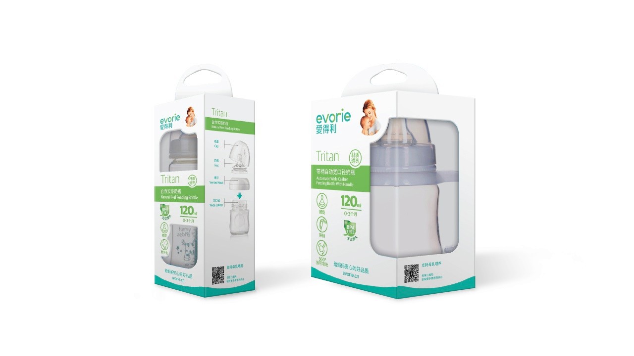
One of the major design changes is to move away from the previous magical and playful design style to a more harmonious and calm setting that’s in tune with the target audience. The post 80s mums are interested in good quality products that are made with safe materials. The design must reflect these key insights and portray a more scientific and sophisticated image.
To create a familiarity with the old packaging, we decided to keep the ‘Mother and Baby’ element in previous IvoryBaby designs. Labbrand iconified this symbol and included it in the new Evorie product packaging so consumers can recognize the brand despite the name change. The new ‘Mother and Baby’ will be more modern and aligned to the new packaging design.


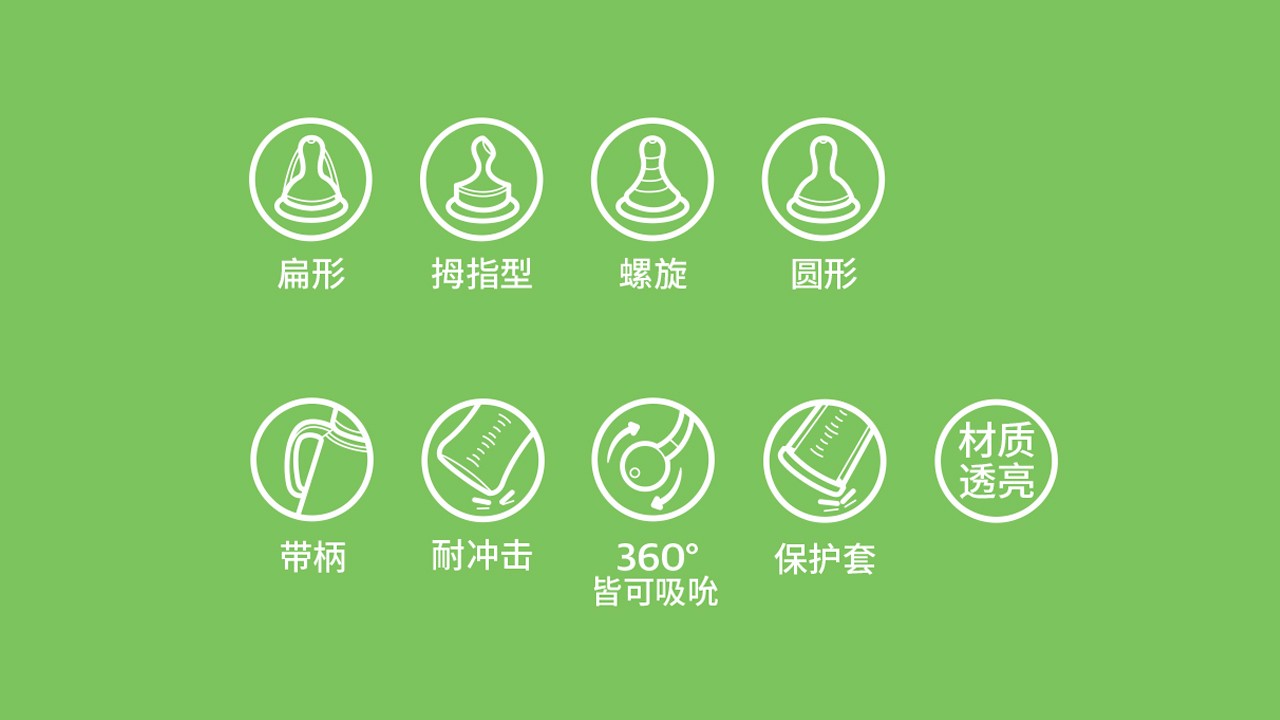
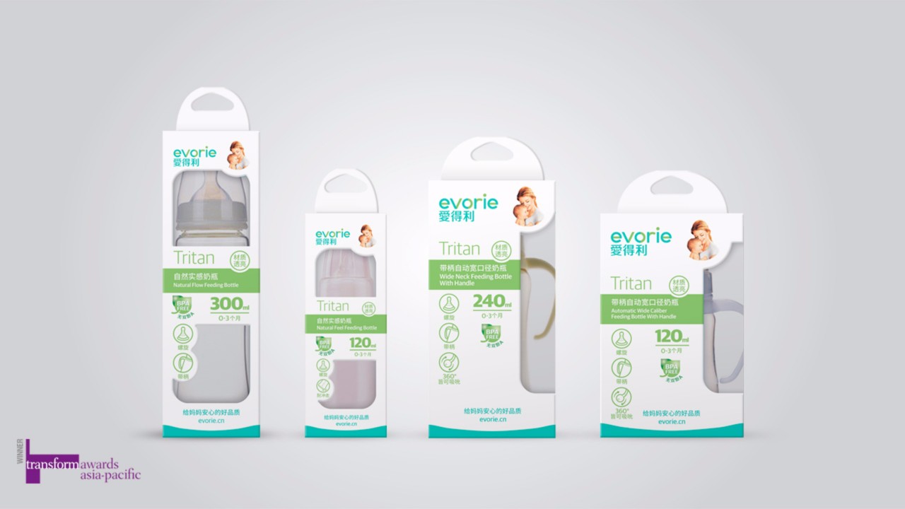
The old product packaging does not have a clear system to distinguish different product categories. With Evorie expanding into maternal care as well, we adopted a new community of colors to identify different product categories and adjust accordingly to industry rules and regulations.
A Labbrand Group Company © 2005-2024 Labbrand All rights reserved
沪ICP备17001253号-3* Will be used in accordance with our Privacy Policy
To improve your experience, we use cookies to provide social media features, offer you content that targets your particular interests, and analyse the performance of our advertising campaigns. By clicking on “Accept” you consent to all cookies. You also have the option to click “Reject” to limit the use of certain types of cookies. Please be aware that rejecting cookies may affect your website browsing experience and limit the use of some personalised features.