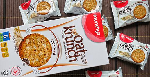

When consumers step into a supermarket, they face sensory overload: dozens of displays with multiple brands. Which noodles or snacks a consumer buys may sometimes seem random, but it’s far from the case: in the absence of taste, packaging is a primary touchpoint to connect with consumers. People engage with packaging early on in the buyer journey, making it an important communicator of perceived quality and experience.
How will your packaging catch the eye of consumers, enable an interaction, and ultimately lead to continued repeat purchases? How can your brand stay relevant to consumers over the years? In this article we will explain the role of semiotics in packaging design, using examples from the Biscuit category in the Malaysian market.
Oftentimes, brands find themselves in a situation where packaging design is based on personal aesthetic preference, applying one packaging – even in the same language – across countries. But while having radiating bursts on biscuit packaging may signify energy and vitality in Malaysia, it may not work in a market that doesn’t associate biscuits and cookies with energy, like in Japan.
There is more science in product packaging than first meets the eye. There is where semiotics can reduce the risk of confusion and boost the possible connection with consumers.
Semiotics is defined as the study of sign systems: signs and symbols convey different messages in different cultures and contexts, and convey different meanings to consumers. For example, in India a bull is a sacred symbol, whereas in Indonesia it represents strength and a hardworking attitude.
Consumers learn and form perceptions in ways that are shaped by deep-rooted cultural and category codes through repeated exposure. For example, placement of cocoa on food packaging signifies chocolate flavor – but even within flavor, there can be more layers to it. An image of rolling cocoa nuts between satin communicates a smooth and rich chocolate flavor, preferable in markets that perceive chocolate as a luxury good.
For brands, semiotic research can define category codes. By analyzing and categorizing a spectrum of associations into residual, dominant and emerging trends for a category, brands can develop packaging that adheres to consumers’ subconscious associations and at the same time is different from competitors.
Compared with usual Marie, ginger snaps, cream crackers and butter cookies popular in the United States or Europe, we see lots more variations in the Asian market: different combinations of sweet and savory with an assortment of flavors. In Malaysia, however, the biscuits industry is a traditional and matured industry with little innovation over the years. How, then, are brand owners in Malaysia standing out from local and global competition?
Studying some of the popular biscuits and cookies brands in Malaysia, we are able to identify some common elements of the packaging:
From these elements, we can group packaging designs into 3 semiotic categories:
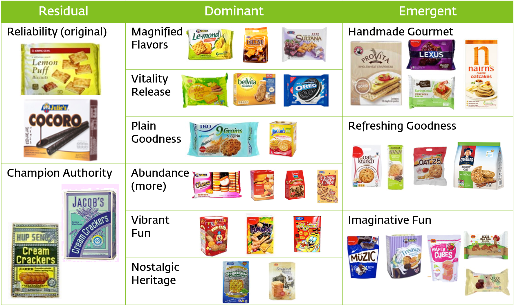
The three broad categories are defined as follows:
In general, we see a trend of biscuits packaging moving from single-minded, plain reliable packaging that features only the product to emergent trends that focus on scenario and outcomes from consumption of the products.
Once we’ve performed the category audit, it’s helpful to take a step back and identify why these category codes exist: the three categories are representative of the role biscuits have played in the life of Malaysians.

At first, biscuits were viewed as a staple in Malaysian’s diet for tea or supper, generally sold in huge tins for value and air-tight freshness.
With the growing economy and increasingly busy lifestyles, biscuits became a familiar snack in consumers’ lives. Flavors and varieties expanded to satisfy stratified tastes. New product development in local familiar flavors and types like white coffee, pandan, banana, and vegetable add familiarity and diversity to the category. This manifests itself in the packaging design as well: new formats emerged in smaller quantities to allow for less frequent consumption, and bright colors, bursting rays, and magnified images place emphasis on the richness of the product.
As society embraces more the concept of healthier living, we see more healthy options pop up in the biscuit category: oats, grains, and even Chia seeds are becoming common ingredients in brands like Munchy’s Oat Krunch and Baker Brothers. Design codes are embracing a return to simplicity, with lighter shades, clear lines, and hand-written fonts to draw emphasis on the removal of artificial ingredients and the increase in handmade and organic baking techniques.
Brands looking to enter the biscuit category in Malaysia must focus on these semiotic codes to guide their package localization, as well as broader strategic thinking.
These categories together give us clear groupings in which we can place a product. This allows us to spur new innovations and yet not steer too far away from the familiar codes.
To stay relevant to consumers in today’s context, we can deep-diving into the Emergent section, where several sub-categories arise. Through this unfolding process, guidelines and new ideas of how to shape a strong packaging design become clear.
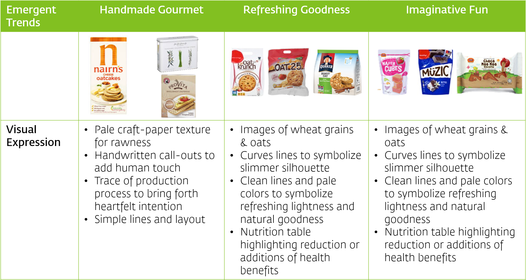
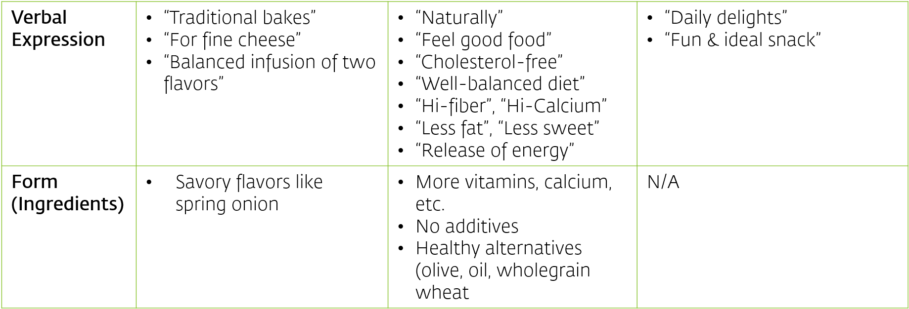
From the above deep-dive, we understand distinct visual cues that we can synthesize and redirect towards a new packaging design in-line with emerging consumer tastes – much of which is revolving around highlighting healthier ingredients.
It may seem, after a quick look, that product innovation is limited to this healthier living trend. However, applying the semiotic square analysis, we can see that white spaces exist beyond the trends currently being targeted.
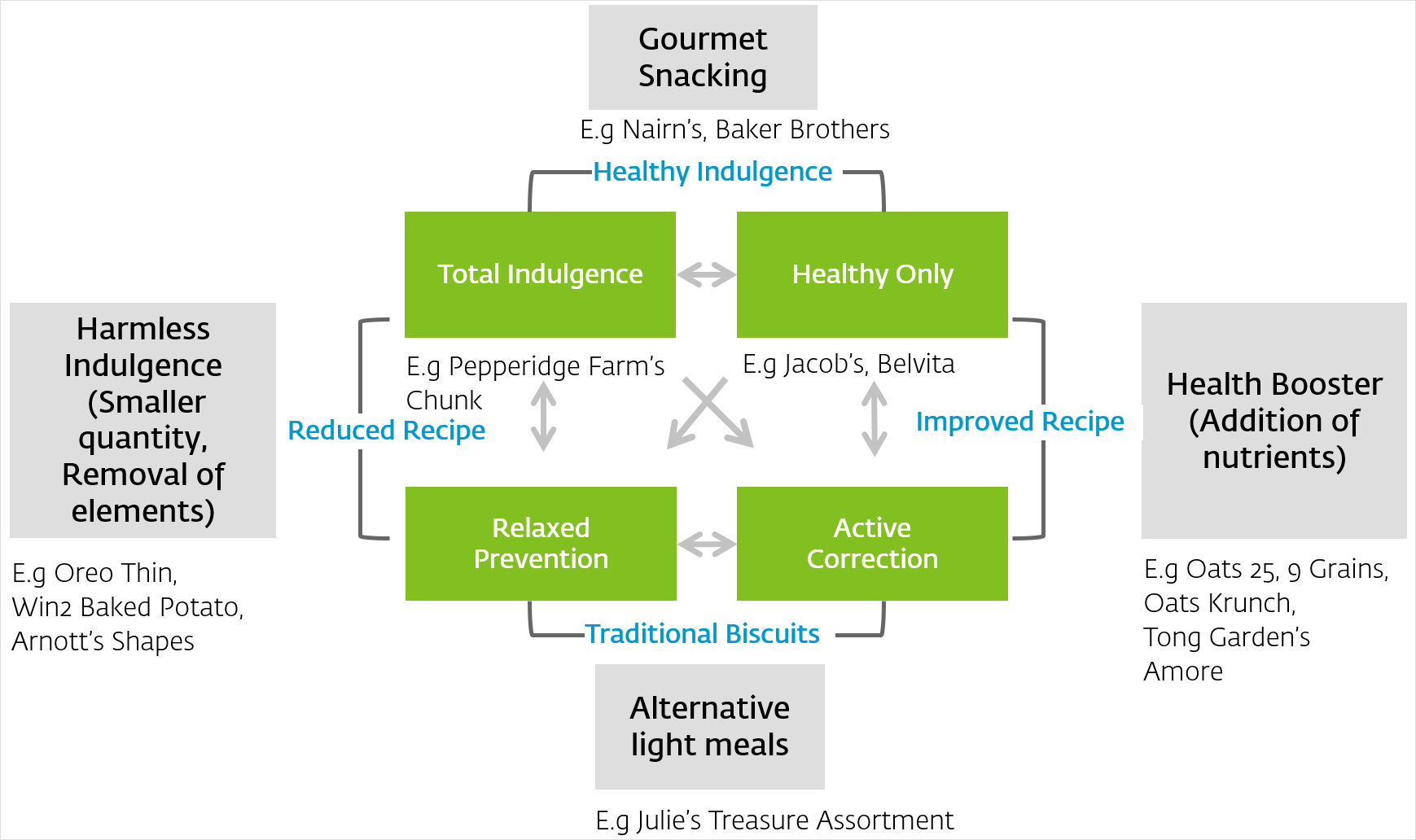
We see new entries of Nairn’s and Baker Brothers, for example, in a relatively new section of gourmet snacking that uplifts the traditional status of biscuits to gourmet eating level. Scenario-based snacking exploration opens up more opportunities for the biscuit category to merge with likely future preferences.
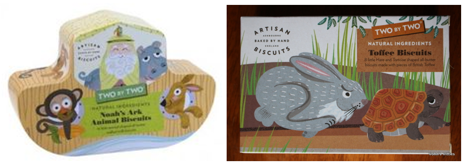
Coupling the semiotic square analysis with scenario-based consumption, one is able to build upon ideas for new product development. Artisan Biscuits from the UK has a series of animal-shaped, non-gluten biscuits based on familiar stories, a healthy way to engage children.
In categories where consumers are inundated with information and options, the most direct way to form a bond with consumers is to appeal directly to their cultural affinities. These subconscious cultural affinities are tricky to pinpoint through other consumer research techniques.
Semiotics allows us to identify and connect with these cultural codes, calling upon the information for product innovation, packaging design, and more. It is an effective methodology for conducting market research which provides valuable information to formulate brand strategy and guide the creative dimensions of your brand based on categorical trends and cultural influences.
From the above analysis, we can see there is still much room for product innovation opportunities in the biscuit market in Malaysia. Perhaps it’s time to shake up the sleepy category.
A Labbrand Group Company © 2005-2025 Labbrand All rights reserved
沪ICP备17001253号-3To improve your experience, we use cookies to provide social media features, offer you content that targets your particular interests, and analyse the performance of our advertising campaigns. By clicking on “Accept” you consent to all cookies. You also have the option to click “Reject” to limit the use of certain types of cookies. Please be aware that rejecting cookies may affect your website browsing experience and limit the use of some personalised features.