

Platform brands exist in every industry, but the considerations are not all the same. In finance, where hundreds of companies now specialize in using new technology to offer financial services, digital platforms create a new category of platform brands with its own set of design principles.
To put this in perspective, the Internet finance industry (also known as “Fintech”) in China has boomed in recent years. The country leads the world when it comes to total users and market size, with 3 main categories: mobile payment, financing, and wealth management. The main players in the internet industry (Alibaba, JD, and others) have developed strong Fintech platform brands already.
For platform brands in Fintech, design helps define a platform’s safety and reliability. This article will explore the design of platform brands in Fintech, looking at traditional banks, global Fintech brands, and Fintech leaders in the China market. Finally it will uncover 3 key elements of designing for trust.
First, let’s take a look at how the traditional players in finance: it is important to first understand the design roots of financial services before getting into the design of Fintech platforms. From the get-go, there is a clear focus on a consistent application across the wide range of services. How else are major banks introducing the key design components of financial services?
As one of the established brands in the international financial market, Citi has a wide range of sub-brands that provide different services. The iconic ‘Travelers umbrella’ symbol is the most recognizable element in the logo, symbolizing the company’s efforts to keep its clients satisfied and secure against all sorts of financial upheavals. The design of the Citi Ventures logo, which invests in Fintech initiatives such as Square, Chain, and Betterment pull from these visual assets.
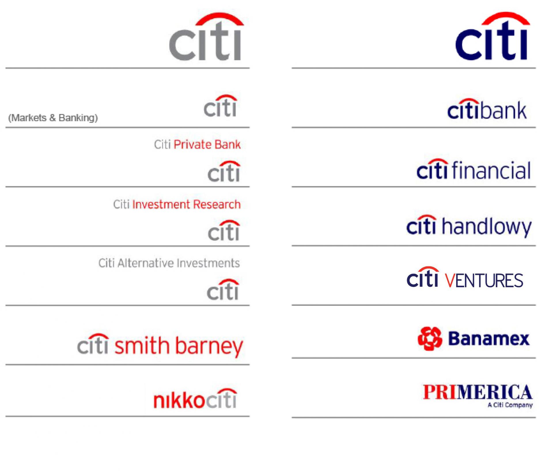
The brand colours, blue, red and grey also play an important role in the logos, they can also be applied to the sub-brands which are not formed with customized logotype but also create the visual connectivity among the master brand and sub-brand logos. The visual consistency is applied throughout the brand portfolio, giving users a sense of trust across services from investment research to financial technology investment.
The logo design in BNP Paribas brand architecture shows the high consistency of the brand elements. The basic logo structure consists of the brand name, descriptor and the group signature, the four stars “taking flight” emblem, a symbol of dynamism and progress, is a strong visual asset in all the logos, to build a memorable brand identity. The colours of the symbol and logotype are also applied throughout the logos.
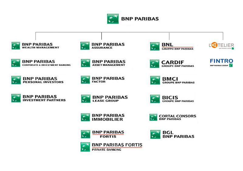
For those newly acquired companies, such as those specializing in Fintech, the existing logo is kept as the visual asset of the brand. The BNP group signature and descriptor are added for master brand endorsement.
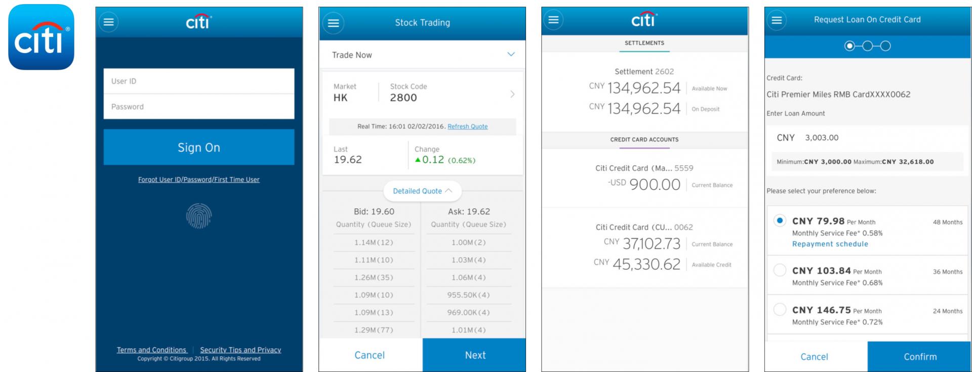
Even before designing platforms specifically for Fintech, the user interface design of online touchpoints give a hint at design principles. Citi’s signature blue is the most recognizable element to the users: it creates brand awareness and visual impact. The customized brand typeface is applied in the text heavy application design; it brings out the unique character of the brand and also ensures the legibility.
For BNP Paribas, beside the primary green colour, a range of secondary colours are widely applied across platforms. It helps to organize the hierarchy of the information, as well as differentiate the user interface. A special typeface is used in the mobile app, designed to be narrower to save more space for content in the limited mobile format.
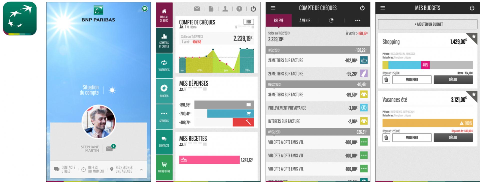
While L’Atelier (PNB’s Fintech division) develops a Fintech-specific platform to achieve awareness, there is a clear design focus for the major banks: they are able to deliver a strong level of consistency across logo structures and specific platform applications. This establishes a heritage and trustworthiness that plays to their strengths. Newly acquired Fintech brands should fit into this.
Up-and-coming Fintech firms know that design plays an important role in connecting with the consumers. The resources also need to be focused properly for the optimal design impact: worldwide, there is a range of different colors applied, representing different aspects of finance and technology. Logos typically denote immaterial shapes, while a visual tonality of cleanliness and consistency helps establish trust with users.
Most global brands in the Fintech area deliver the values of sustainability, flexibility, and modernity by using abstract symbols in logo design. The graphic components are simple and clean. In terms of colours, luminous green, blue, purple and other neutral colours are widely used to represent the accessibility, techy and mobile aspects of financial technology.

Simple launched in 2012, offering a forward-thinking and tech-enabled alternative to traditional banking options. With a slick web UI and mobile app, Simple set itself apart from the monolithic banking products of the day.
The visual identity system reflects the brand name and the tagline: “Save easily, bank beautifully”. The brand colour and idea of “simple” are applied throughout the logo design, UI design and the application system. The overall look and feel appears in light blue and white, bringing out the brand tonality of simplicity and cleanliness.
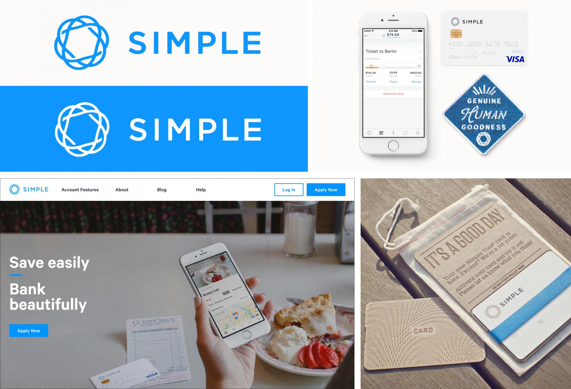
For Simple and many other brands in the global Fintech space, the ability to apply brand tonality across the visual system is important to establishing a consistent experience that can stretch to different applications.
In China, platform thinking has allowed some of the biggest brands – in areas as diverse as e-commerce and social media – to already establish a presence in the Fintech space. These platform brands are strong in managing multiple brands within a single umbrella, and have remarkable consistency while still emphasizing the flexibility in their portfolio to call upon different aspects of the visual system to bring out different emotions.
These platform brands also pull from heavy experience in designing digital platforms to offer best practices as applied to Fintech platforms, with a strong range of innovation in design.
This is especially important when multiple brands under one umbrella come into play: these logos are viewed together, reinforcing and supporting other logos in the portfolio.
Ant financial, for example, is the largest Fintech service group in China. Businesses operated by Ant Financial and its invested/controlled companies include Alipay, Ant Fortune, Zhima Credit and MYbank, covering services across online payment, wealth management, and financing (independent credit scoring and private banking).
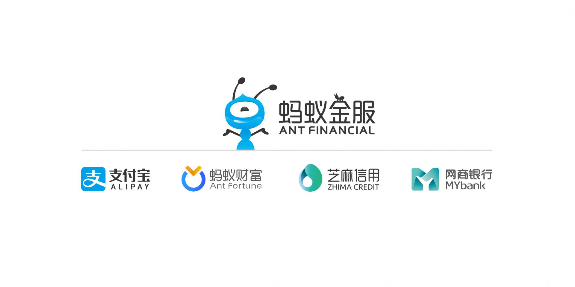
The visual architecture of the logo shows how the master brand visual assets are applied in sub-brand logos. You can see the primary blue in the AliPay and Ant Fortune logos, to express the common values of financial services – trustworthy and reliable. On the other hand, Zhima Credit and MYbank use a fresh blue to green gradient, to promote the new type of services to the young and mobile generation. Stylized san serif Chinese logotype keeps the modern style of the internet industry.
JD Finance, another market leader, provides online financial services such as e-wallet, online credit and crowdfunding. The company was founded in 2013 and is headquartered in China; JD Finance operates as a subsidiary of JD.com, Inc and was ranked No.10 globally in KPMG’s 2016 Fintech 100 list.
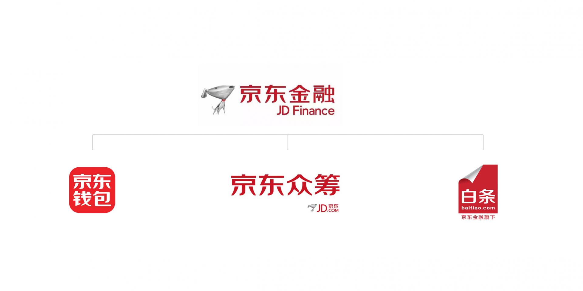
From the visual architecture, we easily understand that the logos keep a highly consistent appearance of the brand identity system. The customized logotype plays an important role in logo structure, as it visually connects the masterbrand and sub-brands with a unique JD identity. The primary colours, red and silver, are also applied into the sub-brand logos.
A unique aspect of Fintech platform brands is that that the experience is all within the UI. Whereas in traditional Finance, the brand experience stretches to many other touchpoints such as in-store experience, call centers, and traditional mailing; in Fintech the entire experience occurs inside of the digital platform. Of course, leading companies invest a lot of effort into the UI of these digital platforms.
Alipay is a third-party online payment platform, launched in China in 2004 by Alibaba Group and its founder Jack Ma. According to an analyst research report Alipay had the biggest market share in China with 400 million users, with control of just under half of China’s online payment market in October 2016.
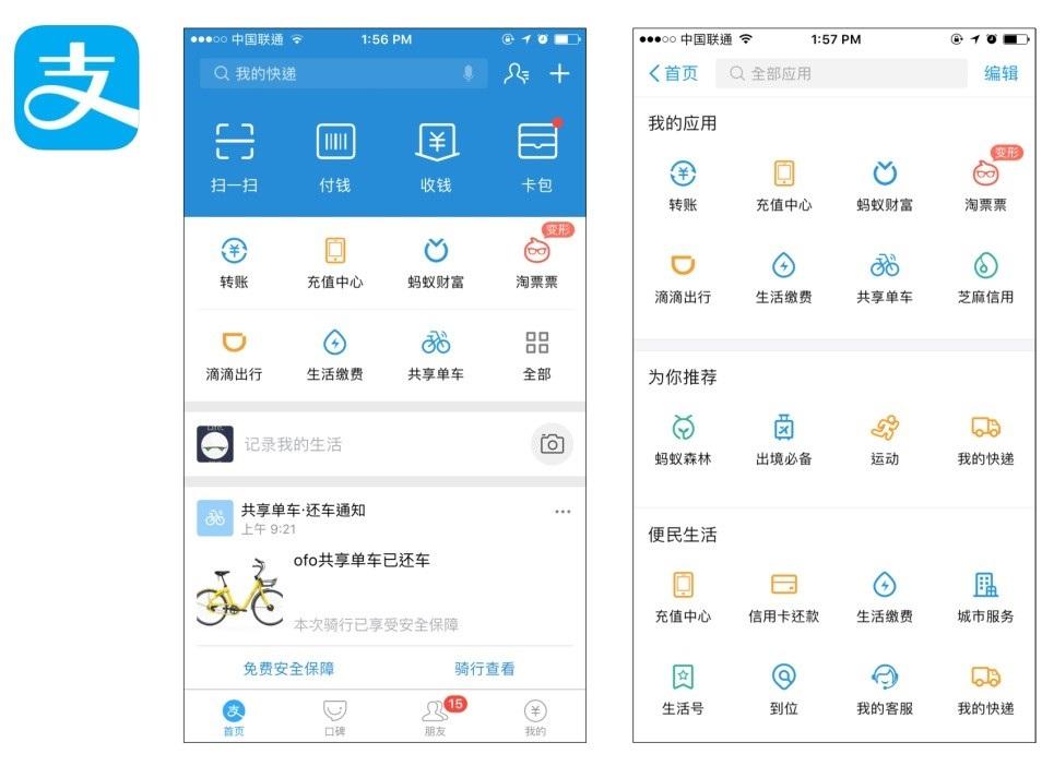
The mobile app shows the primary brand colour: light blue is applied to the background, the text as well as the icons, to bring out the brand values: trustworthy, fresh and young. It also keeps the brand’s visual consistency from online to offline (such as in merchant QR codes). There are some other secondary colours used in the icon design to highlight and promote particular services.
China’s second-largest e-commerce company JD.com has added an innovative layer to its mobile platform, through which 3rd party financial institutions can build and operate their own investment product sales platforms.

The JD Finance mobile app includes all the functions under the masterbrand. Users are able to access all services in one digital platform, the brand has a great opportunity to create a holistic brand and user experience for the user. But as we can see from the landing page, the promotional key visual and the icon design lack connection to the masterbrand.
For brands like Ant Financial and JD Finance, design elements like logo organization and user interface are already second nature, refined and tested through other platforms. Fintech platforms from these market-leading brands carry best practices of digital platform design to the financial industry.
Fintech is booming in China and growing in the worldwide market. The question of how to create and make the brand sustainable becomes a challenging topic, but there are some common values that financial service always emphasizes – trustworthy, safety and convenience.
The values should be considered when the brands create their visual identity system: maintaining the visual assets from the well-known masterbrand is a possible approach, as it helps the users to connect the sub-brands with the masterbrand visually. Simple, straight-forward and clean look and feel also conveys the accessibility and easy-to-use values to the young and techy target audience of Fintech.
No matter the visual identity direction, application is even more important. Besides the logo design, which is a first touchpoint for users, the UI design is the primary touchpoint that users interact with. The visual assets must be applied into the UI not only in common touchpoints but with the breadth and depth that allows the visual system to expand to as many touchpoints that appear in the digital platform.

To help design for trustworthy experiences, platform brands with different Fintech focuses prioritize different aspects:
A Labbrand Group Company © 2005-2024 Labbrand All rights reserved
沪ICP备17001253号-3* Will be used in accordance with our Privacy Policy
To improve your experience, we use cookies to provide social media features, offer you content that targets your particular interests, and analyse the performance of our advertising campaigns. By clicking on “Accept” you consent to all cookies. You also have the option to click “Reject” to limit the use of certain types of cookies. Please be aware that rejecting cookies may affect your website browsing experience and limit the use of some personalised features.