
No matter your brand’s situation, local market packaging to consumers in China is challenging.
In our recent piece on the 5 best and worst Chinese branding adaptations, we gave a few historical examples of huge miscommunications between brands and consumers – like Mr. Muscle being translated semantically into 肌肉先生 [jīròu xiānshēng], a direct homophone of “Mr. Chicken”. Thankfully, most brand blunders are corrected quickly by the internal branding teams and in 2016 these large-scale oversights are rare.
Now we see issues of brand localization happening at the tangible level; specifically, in struggling to effectively localize a product’s packaging. Here we will share some insight from Labbrand’s presentation at the Food and Beverage Innovation Forum 2016: challenges you may not expect during packaging localization.
Package localization in China is like a wedding dance: the visual identity is the newlywed couple dancing on stage, catching the eyes of the audience, enveloping them in a beautiful display. The dance can be a fiery, jaw-dropping salsa, or it can be an elegant and refined ballroom dance, but no matter the style there is always a shining diamond – the verbal identity – which nobody can take their eyes off. Together they create something striking.

But how large should the diamond be? What cut is best suited? Some brands choose to show local verbal identity in an understated fashion. Evian 依云, one of the world’s premium water brands, chooses to focus on its Latin name to remind consumers of the natural source at Evian-les-Bains in France. The Chinese name 依云 (to sit on a cloud) is shown only lightly on the side. Conversely Nestle Pure Life shows the full Chinese name 雀巢优活 (Nestle Outstanding Life) exclusively to speak natively with its expansive target of families in China. The signature lockup leaves no trace of a foreign brand.

Evian, Nestle Pure Life
In this article, we will go into the elements of effective package localization, analyzing several cases through their Visual and Verbal Identity components. These components can each be divided into three areas: Chinese Culture, Brand Idea, and Category Positioning.
There is no one style of dance that is universally better. A young couple may choose an energetic and lively dance that fits their personality while an older couple’s dance could be entirely different. The newlyweds must discover what works best for them. What does the audience want to see? More importantly, what do the newlyweds want to show?
We can define a Visual Identity on localized packaging as the combination of logo, color palette, photography style, graphic style and fonts. How a brand optimizes this combination is oftentimes the difference between being idolized and ignored.
As foreign brands try to connect, there are a few obvious routes to be taken that align with traditional Chinese culture, such as identifying with the Chinese New Year holiday during the first quarter of the year. Color palettes of red and gold are common across FMCG brands for these promotions, as well as revamped graphic styles that highlight popular elements like gift-giving or the new year’s Chinese zodiac animal.

Smirnoff , Nutella, Häagen-Dazs
Expressing your brand idea on a localized packaging is a major opportunity for communication. In China, there are 3 types of visual identity codes that international brands can focus on:

Nongfu Springs, Dove Chocolate, Xiaoming
But each category is different, and what works for the ready to drink (RTD) tea industry will not necessarily work for a brand selling spirits. Mapping out the category’s competitors, saturation points, and white spaces will allow you to develop distinguishable local packaging.
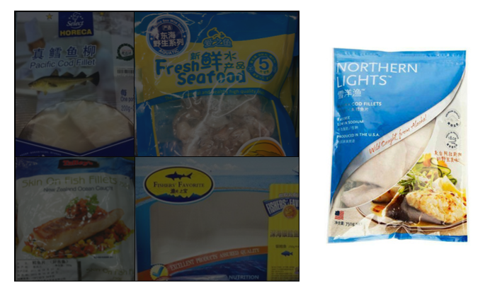
Northern Lights’ local packaging shows us how to draw upon category best practices: its Chinese name 需洋渔 is understated below its large foreign name to emphasis product origin; its color tones are comprised of blue and white with a wavy-style window to remind of fresh ocean; it draws upon professional photography style to show healthful creations.

No matter how beautiful a dance is, it means more with the diamond ring. The cut, clarity, carat of the ring can reflect a local flair or a foreign taste, and when made correctly this gemstone can form an emotional bond with whoever is watching.
The Verbal Identity on localized packaging is comprised of a brand’s local name and tagline, and can either steal the show or scare shoppers away.
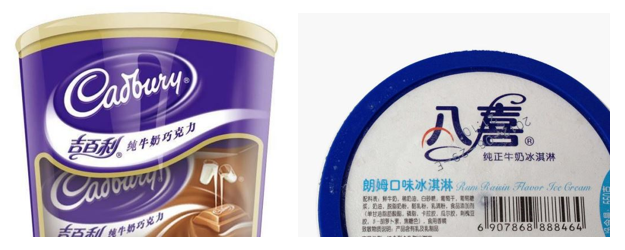
Some characters in Chinese draw distinctly positive associations because of historical significance, or because they are part of a multiple-character phrase with positive associations, or because there is a distinct cultural inclination towards the meaning. Cadbury 吉百利 leverages the characters for “auspiciousness” in its Chinese name, while Bud’s Ice Cream 八喜 combines the lucky number 8 with one of the two characters that comprise “happiness”.

Cadbury, Bud’s Ice Cream
The Verbal Identity’s role in expressing the brand idea is meant to last, and as such a company must choose carefully its local name. For international F&B brands entering the market, there are 3 types of verbal codes we can focus on:

ChaPi, Chips Ahoy!, KFC
In a given category, Chinese names tend to revolve around similar language codes. Mapping out where there is heavy saturation among verbal identities can allow you innovate around the edges.
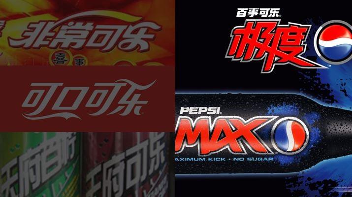
Pepsi 百事可乐 operates in the well-known carbonated beverage category, in which many brands follow Coke’s lead by translating “Cola” to 可乐 [kělè] back in the 40s – a phonetic similarity that can be roughly translated to “allow happiness”. But as Verbal Identities in the category look increasingly similar, Pepsi MAX leveraged a loud and intense local translation to allow for greater differentiation: 极度 [Jídù], which directly translates to “the extreme”. The Visual Identity assists in the emphasis on 极度 with a bold typeface and lockup.

Pepsi MAX
Like the groom slipping a gemstone onto his bride’s finger, Verbal and Visual Identities must complement each other; the flow of one must be reasserted by the other. They must be synchronized from the first step forward. When designing a localized packaging, we must always consider the importance of Leveraging Visual & Verbal Together.
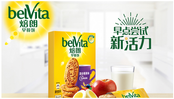
BelVita Breakfast Biscuit is a best practices case of this. The Verbal Identity refers to slow baking with sustained energy, and implies sunny mornings and clear skies with a bright, energetic tone. The Visual Identity uses high-caliber photography, a friendly font, and a bright color palette to catch the eye of the consumer and drive home a healthy, balanced, and positive message.

belVita
Overall, we can say there are 4 other takeaways that can be useful regarding packaging localization in China.
How is your brand localizing its packaging?
A Labbrand Group Company © 2005-2024 Labbrand All rights reserved
沪ICP备17001253号-3* Will be used in accordance with our Privacy Policy
To improve your experience, we use cookies to provide social media features, offer you content that targets your particular interests, and analyse the performance of our advertising campaigns. By clicking on “Accept” you consent to all cookies. You also have the option to click “Reject” to limit the use of certain types of cookies. Please be aware that rejecting cookies may affect your website browsing experience and limit the use of some personalised features.