

Navigating the dynamic Chinese market prompts brands to consider the extent of adaptation needed and how to balance it with their international heritage. As both foreign and local companies vie for consumer attention, strategic positioning becomes crucial. The visual language plays a pivotal role in conveying the desired brand image. To address these challenges, examining brand identity touchpoints is essential. This process involves understanding how identity design can effectively establish a brand’s local or international image. Explore three key elements that guide this transformative journey.
Brand Signature
Brand signature is an important part of the identity design. It represents a company and brand’s core identity and is often the first item brands focus on in terms of design. The most common form of brand signature is the combination of symbol and logotype. In applications, we often design more than one variation of the combination lockup.
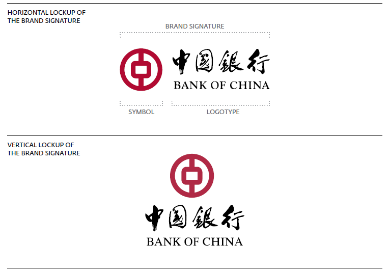
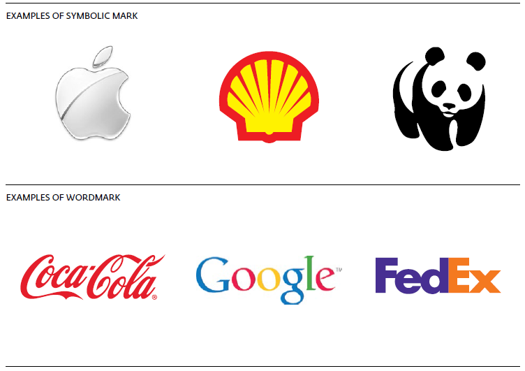
Other than the combination form, a brand signature can also be stand-alone. If a brand signature only contains a symbol, which is a rare case, then this is called Symbolic Mark. If a brand signature contains a stand-alone distinct typographic treatment of the brand name, then it is called Wordmark; such examples include Coca-Cola, Google and FedEx.
Creating Relevant Ties with Chinese Culture Through Symbol and Logotype
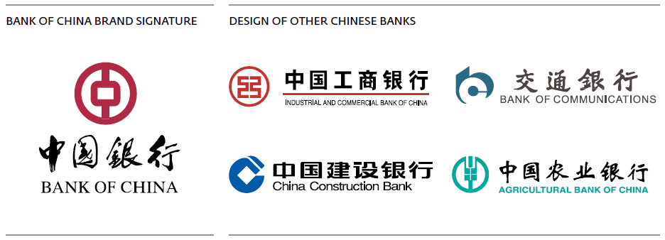
For brands who are looking to deeply localize in China, one of the techniques is creating a symbol within the brand signature that ties in with Chinese culture and heritage. For example, the brand signature for Bank of China designed by Mr. Kan Tai Keung. In the symbol, the Chinese character Zhong (中) was engraved in the center of a traditional Chinese coin, with the vertical stroke in Zhong (中) representing an auspicious ribbon. The logo, distinctive and modern, delivered a unique Chinese flavor. This approach became a benchmark for later logo designs in the Chinese banking industry. Other banks followed a similar approach by using the traditional Chinese coin element.
To carry the Chinese identity further, the logotype for Bank of China used classic calligraphy style in design. The characters are written in Traditional Chinese instead of Simplified Chinese to reconnect this brand to its deep Chinese roots; the logotype is handwritten by one of the masters of Chinese calligraphy Mr. Guo Mo Ruo. Because of this logotype treatment, Bank of China’s design stands out from other competitors even if the symbols have a similar style.
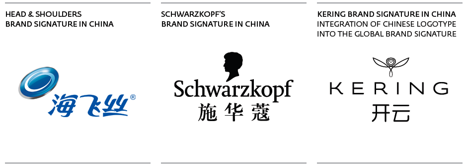
On the other hand, for established foreign brands entering the Chinese market, the symbol and logotype have already been designed. In these cases, if brands would like to localize for Chinese consumers, they will either adapt the logotype into Chinese or add a Chinese logotype into the original one. This is a common practice in the FMCG industry. But over the past two years, we are also seeing this action in other industries, such as luxury.
What Kering did is quite interesting to examine. They’re taking a common practice in one industry and bringing it in the luxury industry to have a new perspective — a move that is forward-looking for the future Chinese luxury consumers. If we take a closer look at Kering’s recent company report, almost all of Kering’s luxury brands are now referred to by their Chinese name then followed by their Alphabet name in brackets. This is quite a big leap for luxury brands.
Just a few years ago, Gucci did not even have an official Chinese name or chose not to disclose one. Luxury brands are starting to connect with consumers and creating a more intimate brand atmosphere. We will most likely be seeing more of this shift in localizing a global brand signature in other industries that traditionally have chosen not to do so.
Wordmark Typography
Not Creating Ties with Chinese Culture
While some brands want to relate to their heritage, certain Chinese brands choose to take on a more international and global approach. This is the case with Stella Luna, a Chinese brand who has successfully established itself with a European background in China. Besides communicating on their European roots, Stella Luna also aligns with this direction in terms of design.
The parent company of Stella Luna, Stella International Holdings, is the footwear manufacturer of Céline, DKNY, Emilio Pucci, Givenchy and other famous global brands. In 2006, the company decided to create its own brand to capture the growing market in China. In terms of design, Stella Luna adopted a similar strategy with other foreign footwear brands — using a clean and modern wordmark. Stella Luna utilizes thin and lightweight type to communicate a contemporary and feminine look. The wordmark adopts a clean sans-serif typeface; each character is spaced evenly and supported by ample negative space. This typographic choice portrays a modern feel and helps to establish Stella Luna as a “foreign” brand in the minds of Chinese consumers. It also aligns with their global expansion plan. Stella Luna now operates in eight different countries and even has a flagship store on Boulevard Saint-Germain in Paris.
However, it’s important to note that this type of thin sans-serif wordmark could pose challenges for visibility at smaller scaled sizes or if read from afar.

How Do Brands Balance Between Foreign and Chinese Wordmark Typography?
For foreign brands in China, how to balance between the original and Chinese wordmark typography can often be a dilemma. In an earlier article “Building Brand Identity in China through Typography,” we noticed that after foreign brands create their Chinese brand name, the names are often materialized through generic and undifferentiated Chinese typeface such as Heiti or Songti. However, entering a new market such as China is optimally served by creating an impactful first impression that accurately represent the brand experience — in another word, a more design-centric approach to the typography usage of the Chinese brand name.
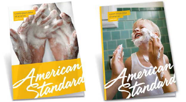
One brand which could consider a refreshed look at their wordmark in China is American Standard. For their Chinese name 美标 [měi biāo], American Standard has decided to use a slanted generic Heiti and placed it beside the English wordmark. The English wordmark was designed to have round edges around the corners and used a form of calligraphic typography similar to handwriting. However, Chinese Heiti has sharp angles on the edges and looks stiffer, creating a lack of balance between the two. The generic Heiti needs to be further developed to work out the corners and align with their original wordmark design.
In August 2013, American Standard also rolled out a new wordmark which is yet to be used in China. Now it’s a good time to reconsider the Chinese wordmark to deliver the new refreshed concept to the Chinese consumers.
Color
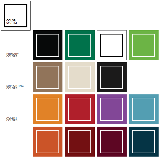
Color is an important and fundamental element of the brand identity. It generates emotional response and long-term impression among consumers. The color choice for a brand signature needs to be carefully selected to reflect a brand’s positioning and core attributes. Within a brand’s color palette, the primary colors are directly derived from the brand signature, whereas the secondary colors are selected to support a wider range of usage across print or digital applications.
Global Yet Local — Leverage Flexibility in Color Adaptation
When it comes to identity design, foreign brands often bring established color palettes from their headquarters. Despite this, brands can still forge connections with local consumers. A case in point is Starbucks, known for its black and green primary colors and various shades of brown. While these colors may not align with traditional Chinese symbolism like red or royal yellow, Starbucks has adeptly integrated them to resonate with the Chinese culture. The key lies in finding meaningful connections and strategically applying the color system.
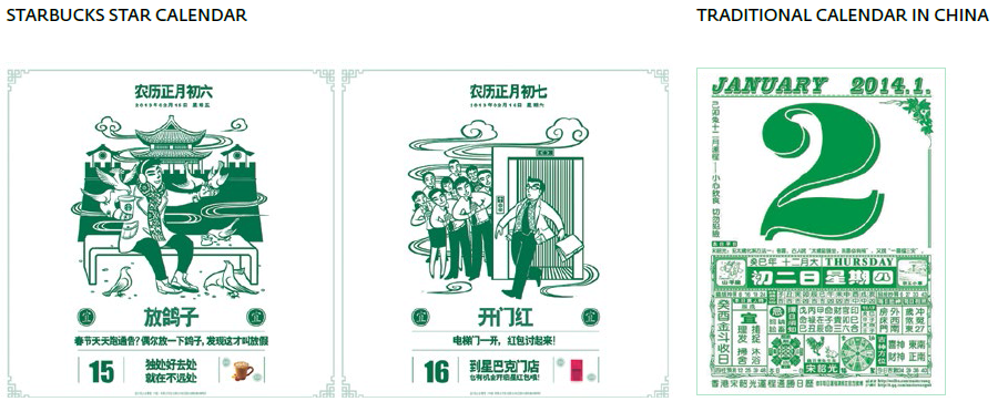
During the Chinese New Year holiday in 2013 and 2014, Starbucks rolled out a special “Star Calendar” with its primary green color. But, how does green relate to Chinese New Year? Actually, the green color links back to the original concept behind the calendar. It references to a type of traditional Chinese calendar that predicts what is appropriate for each day based on the Chinese Almanac. This type of calendar usually uses green or red to print the content. For Starbucks, incorporating this detail and matching it with the brand’s primary green color is a great fit for the occasion. The primary color helps to reinforce the brand and establishes emotional connections with consumers through a familiar cultural element.
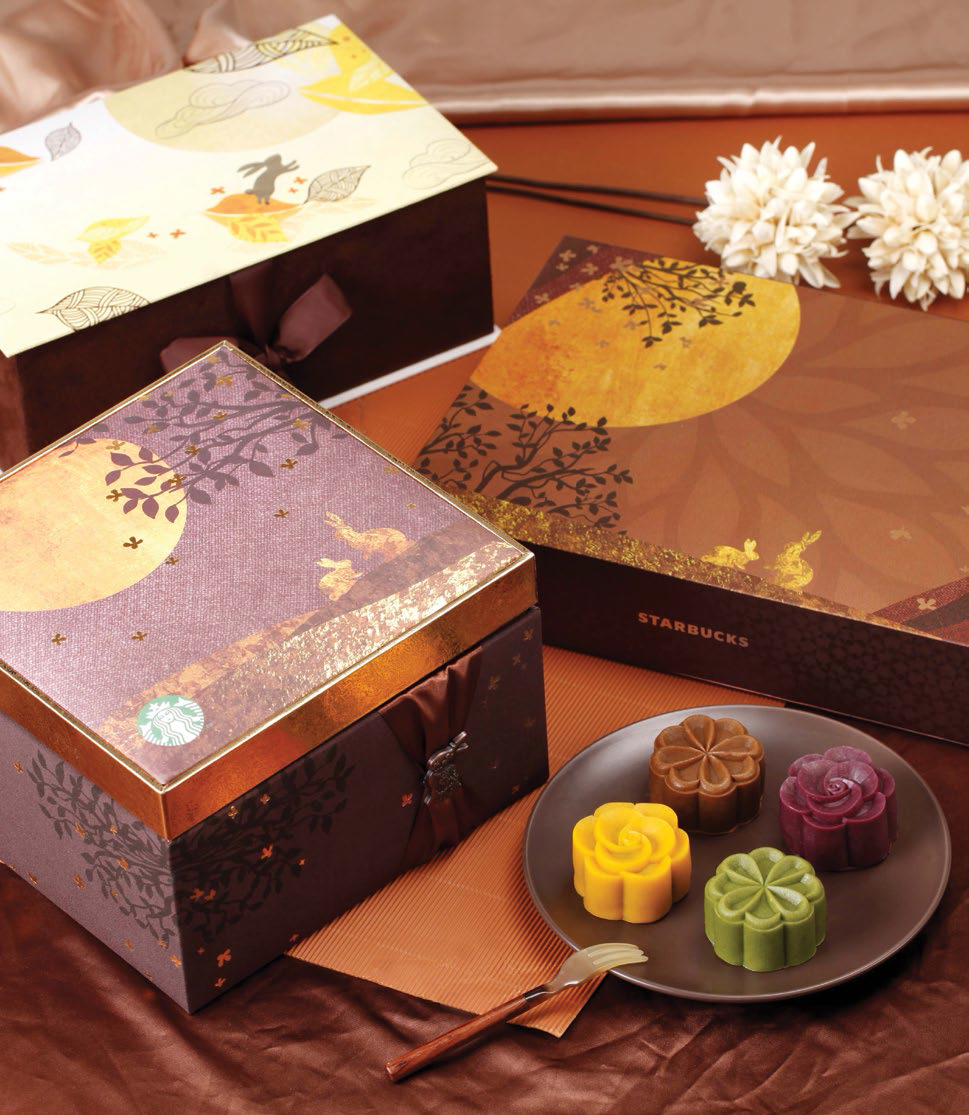
Other than green, Starbucks’ secondary colors are often used in materials which link with Chinese culture. For the Mid-Autumn Festival in 2013, the secondary brown colors were used to produce special moon cake packaging and communication campaigns. Chinese culture is rich in history and color, creating great opportunities for brands. Seeking the most appropriate culture element can be a smart way to shorten the gap between your brand and the consumers.
Conclusion
Managing a brand is a complex business, especially in a market such as China. Whether it’s foreign or local companies, building strong brands in China takes time and effort. Brand identity design is an important pillar to establish that solid foundation for success. But as we continue down the path for success, a brand’s actions among its product, service, communication, and company culture need to be treated with the same consistency and relevancy to create strong brands in this competitive market.
A Labbrand Group Company © 2005-2024 Labbrand All rights reserved
沪ICP备17001253号-3* Will be used in accordance with our Privacy Policy
To improve your experience, we use cookies to provide social media features, offer you content that targets your particular interests, and analyse the performance of our advertising campaigns. By clicking on “Accept” you consent to all cookies. You also have the option to click “Reject” to limit the use of certain types of cookies. Please be aware that rejecting cookies may affect your website browsing experience and limit the use of some personalised features.