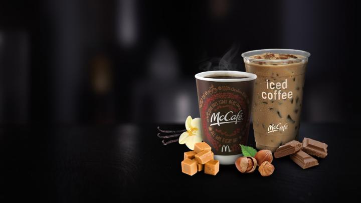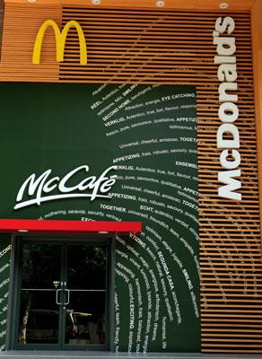

Explore the strategic shift at McDonald’s as Senior Vice President Jim Carras emphasizes the need for change, declaring, “McDonald’s has to change with the times.” Uncover the overarching theme of LIM (Less is More), inspired by the European store redesigns. Beginning in 2008 with the debut of McDonald’s new fast food brand, McCafé, witness significant renovations in key Chinese cities (Shanghai, Beijing, Shenzhen) as part of McDonald’s brand strategy evolution.

According to French designer Philippe Avanzi, the newly designed spaces are trying to enhance customer experience and attract a younger crowd. It is a well-known fact that McDonald’s target consumers in China are 18-28 year olds (CBN Weekly, 11-02-2011). In order to reach out to them, McDonald’s has decided to change the original design of stores.
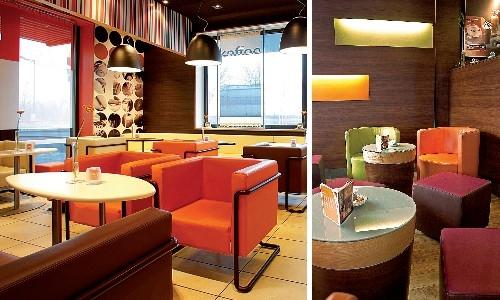
The first step in their design strategy was dropping the “clownish” red that for so many years has been the key element of McDonald’s interior and exterior decoration. This red has now been replaced with more subtle colors, such as light oranges and greens. Another change has been the upgrading of the chairs from industrial steel to wooden and more colorful stools. In some cases, leather chairs have been used. The space was also re-engineered. Dining areas have been divided into several different sections all with different functions to give customers the feeling that the restaurants are bigger than before. Also, all locations provide free Wi-Fi, an important factor to consider in terms of how “connected” new generations are.

The new design shows that the marketing strategy of the fast food giant is changing. According to Philippe Avanzi, it demonstrates the difference between a fast food restaurant and a fast service cuisine restaurant (CBN Weekly, 11-02-2011). The CEO of McDonald’s in China, Mr. Qishan Zeng, believes the new design will attract more customers and will encourage them to stay in the restaurant for longer periods of time. The aim is to use McCafé to attract customers that want to have coffee and rest in the afternoon, a time that is relatively slow for most restaurants. Also, McDonald’s has further developed its original tagline “I’m lovin’ it”, adding to it “make some spaces for happiness” (为快乐腾一点空间, [wèi kuài lè téng yì diǎn kōng jiān]). These changes could mean that McDonald’s is now promoting itself not only as a fast food restaurant, but also as a social space.
McDonald’s believe that the new design will help them win the battle against McCafé’s main competitor on the Chinese market, Starbucks.”The environment is a massive influence on how we behave,” says brand guru Philip Graves. “Change the environment, and you change how people perceive everything else.” (USA Today, 09-05-2011). For now McCafé can only be found inside McDonald’s restaurants in China.

However, now that McDonald’s has changed its strategy and adapted its products to China (people believe the coffee of McCafé tastes as good as other Cafés), how will Starbucks react?
From a brand positioning perspective, it will be even more interesting to see how consumers react to this shift in McDonald’s image from fast-paced to a more soothing and relaxing brand. Will consumers buy this? Only time will tell.
A Labbrand Group Company © 2005-2024 Labbrand All rights reserved
沪ICP备17001253号-3* Will be used in accordance with our Privacy Policy
To improve your experience, we use cookies to provide social media features, offer you content that targets your particular interests, and analyse the performance of our advertising campaigns. By clicking on “Accept” you consent to all cookies. You also have the option to click “Reject” to limit the use of certain types of cookies. Please be aware that rejecting cookies may affect your website browsing experience and limit the use of some personalised features.