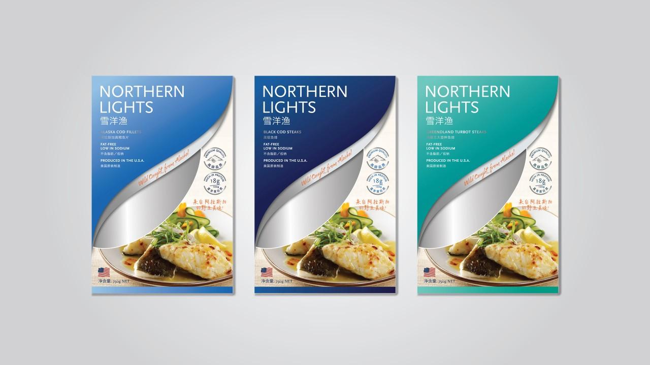

In the realm of brand creation in China, Labbrand collaborates with Clipper Seafoods to craft the Chinese verbal and visual identity for their new brand, Northern Light. This strategic initiative aims to showcase a healthful and fresh image tailored for the Chinese market.
Founded in 1987, Clipper Seafoods sells high-quality, frozen-at-sea fish that are wild-caught and produced in Alaska. Clipper Seafoods products are primarily distributed in Japan, the US, Europe and China. The company is committed to fishing practices that support the sustainability of the fisheries and the environment and is certified by the Marine Stewardship Council (MSC) eco-label.
Clipper Seafoods planned to launch a new B2C brand called Northern Lights in the Chinese market. With Chinese consumers’ pursuit of product quality and safety, especially in food, Northern Lights emphasizes on its promise of providing safe and high quality US-produced fish products. The literal translation of “Northern Lights” is “北极光” [běi jí guāng], which cannot stimulate much evocations in the mind of Chinese consumers.
To ensure Northern Lights successfully launch in China with a strong image of food safety and high quality, we developed a meaningful Chinese brand name, visual identity design, packaging, and website.
Through two rounds of creation and linguistic check, the final Chinese name selected was “雪洋渔” [xuě yáng yú]. “雪” [xuě] means snow, and “洋” [yáng] refers to ocean, vividly representing the natural features of Alaska, meanwhile bringing out the sense of coldness and freshness. “渔” [yú] means fishery, showing the high quality of the US-produced fish products and Northern Lights as an expert and leading fishery. By sharing the same pronunciation, “雪渔” [xuě yú] subtly implies Northern Lights’ featured products – cod, 鳕鱼 [xuě yú]. This name evokes a bright and fresh feel. Moreover, it is in good accordance with the tagline of Clipper Seafoods – Wild caught from Alaska! Besides creating a meaningful and unique name for the client, we made sure to secure the name legally prior to the final selection.
The next step for us was to help Northern Lights develop the brand visual language, packaging, and website for the Chinese market. Through reviewing Northern Lights’ brand positioning and a visual audit of packaging design of the Chinese seafood industry, we recommend the direction of a “Modern American“ or “New American Heritage” stylistic approach, communicating authenticity with a refined, simple elegance in the look and feel. We selected light, energetic glacier colors, fusing the idea of northern lights to indicate Alaska provenance thus demonstrating a healthy and fresh image.

A Labbrand Group Company © 2005-2024 Labbrand All rights reserved
沪ICP备17001253号-3* Will be used in accordance with our Privacy Policy
To improve your experience, we use cookies to provide social media features, offer you content that targets your particular interests, and analyse the performance of our advertising campaigns. By clicking on “Accept” you consent to all cookies. You also have the option to click “Reject” to limit the use of certain types of cookies. Please be aware that rejecting cookies may affect your website browsing experience and limit the use of some personalised features.