
Is a product truly itself without its packaging? As the saying goes – looks matter, and without a properly designed package, a product is hard to sell regardless of how good its other attributes might be. Indeed, packaging design encapsulates what the brand stands for, akin to other elements of the brand visual identity. In certain cases, the packaging is almost as critical as the product itself. After all, what would Coca Cola be without its iconic bottle? This underscores the significance of effective brand translation through packaging design.
In China, as in other markets, packaging design does not only have the function of protecting the product and explaining its attributes and benefits, but it also has the role of appealing to consumers. Studies show that buyers generally decide what to buy at the point of sale . In order to successfully help sell the product, the package needs to differentiate and characterize the product and ultimately to become part of the product experience.
But how can the packaging help the brand engage and attract Chinese consumers? What are the factors to take into consideration to design a truly distinctive packaging for the Chinese market?
In this article Labbrand looks at the impact packaging design has on the businesses operating in China and, in particular, at the issues product brand managers need to consider before falling in the “cultural trap” and developing a package that overlooks at the differences between China and Western markets.
We will look at the components of packaging design in the order a customer may perceive them: colour; label and typeface; images, patterns and shapes; and material.

Selecting the right colour palette for the packaging has a great deal to do with the ultimate success or failure of a product brand. In fact, colour plays an important role in a consumer’s purchase decision . People use a little more than a minute to make up their minds about a product they see for the first time, and a big part of this judgment is based on colours alone. So, clever use of colours in packaging design can contribute not only to differentiate the product from competitors, but also to influence moods and feelings and ultimately attitudes towards a certain product .
“All of us have involuntary physiological and psychological responses to the colours we see,” according to the Chicago-based Institute for Colour Research, a group that collects information on the human response to colour and then sells it to industry. “Colour…impacts our appetite, sexual behaviour, business life and leisure time,” says Eric Johnson, the institute’s head of research studies.
In fact, the same colour may be perceived very differently in different cultures. For example, green enjoys no popularity in Japan, France, or Belgium, while it can be frequently seen on the packaging designed for Turkish and Austrian consumers. People from Islamic cultures react negatively to yellow because it symbolizes death but like green as this is believed to help fight off diseases and evil. Europeans associate black with mourning and tend to prefer red, grey, green and blue. In the Netherlands, orange is the national colour and therefore can be used to arouse nationalistic feelings .
Colours have a strong significance in Chinese culture as well. Yellow, as the colour that was only for the emperor to wear, and red, as symbol for happiness and good luck, are both very powerful colours for designing product packaging for this country market. However, this does not apply to every product category: Chinese consumers generally find appealing these bright and shiny colours for food products but tend to prefer white and pastel colours for personal care and household items.
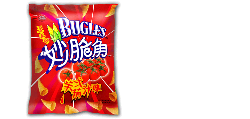
For instance, General Mills adapts the colours used on own product packages in the Chinese market by using bright and flashy colours.

Kleenex, instead, features brightly colour and slightly abstract flowers on the packages sold in the US but it designs Chinese packaging with pastel colours and small, delicate and realistic flowers.

Label and typeface are critical to attract consumers for they are a prominent visual element on any packages.
Different countries have different regulations about the information product labels should or should not contain, therefore size and layout of information on the label may need to change in order for the product to enter a certain country.
Besides country specific regulation on labels, key to market the brand to local consumers is the typeface used on the package. This is especially true in China where foreign brands adopt Chinese brand names, and consequently Chinese typeface, to better communicate to the market.
Coca Cola, to cite a brand that truly masters the art of packaging localization, gives as much importance to the Chinese written brand name as the original English one. The Chinese typeface, therefore, becomes integral part of the brand identity in China and shapes the packaging in an unmistakable way.
So much so that the Chinese side of the packaging is the one that is shown on Coke’s visual communications and ads in the country:

Researchers estimate that more than 70 percent of purchase decisions are made at point of sale . Here the consumer takes in rapidly all the products displayed – and likewise hastily looks for clues that help him make a decision.
Products brands that are successful on the Chinese market clearly take into consideration how images and patterns printed on the packaging influence consumers decisions towards own products.
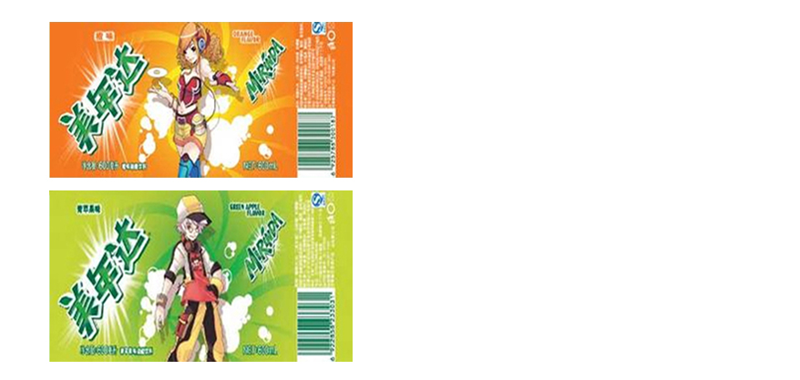
For instance Mirinda, in order to effectively reach the younger segment of the Chinese market, not only uses brighter colours but also features locally beloved cartoon characters on the packaging.

Pepsi, instead, taps into the local culture, people, icons, and activities as inspiration to capture and engage Chinese teens. Pepsi tin reprocess all these elements and uses them to dress itself of a locally relevant package.
Nivea offers a line of lip balm packaged in smaller solutions than the ones sold in the west. That is because Chinese consumers tend to prefer packages of smaller size. This is particularly true for food products, as domestic apartments have relatively smaller storage space and refrigerators than in the US or Europe .
The material used to produce the package it is also extremely important in order to gain the preference of target consumers. For instance, a growing segment of the population worldwide and in China dislikes products using too much waste material for the packaging directly due to environmental concerns.
Price conscious consumers, instead, are less concerned by the quality or recyclability of packaging and are generally more likely to consider other, more function-oriented factors when purchasing a product. However, these factors often depend on priorities that change according to the category of goods, the specific product, and the available budget of the buyer .
In other words, the material used to package a product reflects how much the company understands its market.
Colgate, for instance, chose to differentiate its products in China by using a packaging material that was scarcely used by competitors when the company entered the Chinese market in 1992. Back then, the majority of domestic toothpaste manufacturers used aluminium tubes. Colgate, instead, adopted the plastic tube that is now commonly used by almost all toothpaste brands as this is more convenient, durable, and safe for the user. The new packaging material helped Colgate seize about one third of the market share over the years.
On the contrary, Alpenlibe, the candy manufacturer, uses the same size, design and colours on the packages sold both in the West and China but, in the latter case, it wraps own brand candies with two thick layers of papers as strong packaging is generally associated in China with higher quality products .
Packaging has an incredible power over what people buy. The same way people express themselves through the clothes they wear they also make statements about who they are through the products they buy. Indeed, we buy products not just for their functional attributes but also – and maybe even more importantly – because these products promise to fulfil desires and longings. The package that enfolds the product carries a big part of that promise.
The challenge when trying to build a locally consistent “promise” is to interpret the global brand identity and creative concept in a meaningful way for the Chinese market. The package design needs to attract attention, stimulate curiosity, build a connection and ultimately lead the buyer to think the product is the best one offered. China is a country with a long history and a rich culture, creating codes in the minds of consumers that must be considered during package design. In order to be successful in China, foreign brands need to reinterpret their identity through the eyes of Chinese consumers to truly understand how colours, patterns, images, typeface and material choices can contribute build a meaningful product experience.
A Labbrand Group Company © 2005-2024 Labbrand All rights reserved
沪ICP备17001253号-3* Will be used in accordance with our Privacy Policy
To improve your experience, we use cookies to provide social media features, offer you content that targets your particular interests, and analyse the performance of our advertising campaigns. By clicking on “Accept” you consent to all cookies. You also have the option to click “Reject” to limit the use of certain types of cookies. Please be aware that rejecting cookies may affect your website browsing experience and limit the use of some personalised features.